When constructing the research for my website, I looked at five different types of TV channel and the structure they used for their own websites. I decided that if I used a controversial structure, people would not know what it is for and would defeat the object of having the website. I used the advantage of that everybody knows what a TV channel website is and looks like through their cultural experiences. At the end of my research I came to the conclusion that to produce a successful piece of work, I need to incorporate material that already works well for other websites. I found that everything needs to be centred and in a square structure as it needs to be viewed on every size of computer monitor. Furthermore my researched showed me that it should have a distinct colour theme which would be sustained throughout. The best example of this was from the BBC3 website. I found that its logo and colour excelled all the way through the website; giving it character. That was the main idea I took away for my own project. I wanted to give it a character of its own but it needed to still look like a website. The fact that the BBC3 website also was centred and square gave me motivation to use a similar structure but not copy it. When researching schedule pages for my website, I also went back to the BBC3 website to look for ideas. Unfortunately it wasn’t the style I was looking for. The style I did find however that suited my website perfectly is the Discovery channel website. The way it was laid out and the structure and titles used were a good example to as what people would like to see on my particular themed website. Out of pure memory I remember that the Eastenders website has a full image in the header. I know that my channel isn’t anything to do with a soap however I think that the picture in the header was effective and would look good on mine if I used the right type of picture. I decided that I would do a similar thing and put the picture of the monkey up that I took from London zoo and made it look like it has been taken from a documentary. This is also a good marketing feature that would attract people to the program.
When I started off creating my website, I found that I couldn’t make it look professional; it lacked a shine. I re-visited the websites that I had analysed and found out why my website looked dull. This was because the navigation bar at the top was just a filled table with links. The UK food website gave me the best idea to brighten up my work. I took the green navigation bar and used it to produce my own similar one in Adobe Fireworks. I drew a long rectangle and filled it in with a metallic two-colour combination to give it a shiny effect. This then transformed my whole website into looking professional. There wasn’t much else from that website that I wanted to use for mine.
I now had to come up with a few original ideas in order to make my website look unique and not somebody else’s creation. This was to challenge other types of animal website like animal planet and to make it known for being its own channel so people do not make the assumptions that it is just like the other TV channels. For this, I used the idea of having a robin cam page where I have hosted a camera inside a bird box in my garden with my dad. Hopefully by the spring/ summer a bird will have nested and will attract a lot of positive attention to boost the ratings of my TV channel.
With my TV listings double page spread, I looked at other examples such as “What’s on TV” and “TV guide”. I saw that they were presented in the traditional format of ‘about the TV programs‘ on a few pages and then the TV listings on its own page; perhaps with a couple of programs being talked about again but not in detail. As my TV listings magazine double page spread is there to promote the new TV channel, I needed it to have some conventional material in there but also my own so I changed this by doing a whole page on ‘about the TV programs’ and a whole page on the listings. This came together very nicely. Furthermore I have used a picture of David Attenborough as the main picture to attract animal lovers from afar. My research showed me that this works well so I didn’t feel a need to do anything different.
With my newspaper advert, I didn’t find anything like I expected a newspaper advert to be. I used this along with my ideas to come up with what I have now. This was mainly of an activist approach because people would not normally find the animals I have included portrayed in such a dark way. I wanted to portray it like this as I wanted to again show that Animal Earth is not like all TV channels, it has shock and amazement for all the family.
My media package / products represent examples of life in the animal kingdom. I have used various animal pictures, colours, descriptive text and a simple structure in order to attact a social group of animal lovers. This social group will therefore be exposed to a new approach of animal footage. This will expand the market for TV channels like this one.
Out of all the TV channels I have researched, I think that the DIscovery Channel would take on Animal Earth. This is because it deals and is specialist in the animal/wildlife area and so my TV channel would benefit them. In addition, I feel that all of the TV provoiders would choose to host my channel as it expands the market for this topic. This would bring in new respectable customers and would increase viewing figures fore the providers.
My TV channel website uses video, audio, flash and images in order to communicate to my target audience, being the family in an exciting way. This addressed my audience by using familiar medium in order for the audience to make sense of what I wanted to communicate.
I have mainly learnt how to use Adobe Dreamweaver in a particular way in order to achieve a professional looking website. Furthermore, I have learnt how to use JavaScript and Flash in an effective way to bring my website a sense of profesionalism. The other two tasks I was set didn't require so much technical knowledge in that I was already familliar with certain programs such as Adobe Fireworks, Adobe Photoshop and Microsoft Publisher. Therefore I have come to a conclusion that the Adobe suite is a very good set of programs to use for this type of work.
In conclusion, I think that my website, newspaper advert and TV listings double page spread have come out well and all sustain the same theme linking them all to each other. This will help to associate my pieces of work with the TV channel Animal Earth. If I was to improve anything at all, I would manage my time better in completing my writeup.
Tuesday 23 March 2010
Thursday 11 March 2010


Wednesday 10 March 2010


Discovery channel, HD theater and Petfinder Permission
I didn't feel I needed to write permission for these three logos as this site says that I'm allowed to use them.


Wednesday 3 March 2010

Facebook Permission

Further permissions
Furthermore I as I have made an advert advertising 'cat borstal' on my website, I need to contact the record company BMG for the song "what's new pussycat".
I then need to contact the website who supplied the picture of david attenbrough as that is the only picture I have used from a 3rd party on my supporting coursework material.
I then need to contact the website who supplied the picture of david attenbrough as that is the only picture I have used from a 3rd party on my supporting coursework material.
permissions
I am going to send the letter I have drafted for links on my website.
I am sending it to:
Twitter
Facebook
RSPCA
Find any UK pet
HD theater
Discovery channel
Petfinder
BBC
Forex Trading
The green boat design
I would do it for games except the website seems to be blocked by school websites so it would be included in the marking of my project.
I am sending it to:
RSPCA
Find any UK pet
HD theater
Discovery channel
Petfinder
BBC
Forex Trading
The green boat design
I would do it for games except the website seems to be blocked by school websites so it would be included in the marking of my project.
Drafted email letter to the 'linked' material on my website
I am going to change this to video etc when I need to.
Dear Sir/Madam
I am doing a media project for the second year of my A level course and I would like to use your logo as part of the links for my website. The website is called Animal Earth and the links support the structure of my website; making it look like it has been created professionally so I can achieve the top mark band.
This material will not be used for professional use and it links directly to your website.
Your cooperation in this matter would be appreciated,
Thank you,
Dawn Turnbull
Thursday 4 February 2010
Finished Newspaper Advert

This is my finished newspaper advert. I am very happy with it as it pays attention to detail; especially around the edges. This idea for the date to be around the edges was a one off accident whilst I was experiemnting but I decided to keep it as it looks effective.
Wednesday 3 February 2010
Newspaper Advert First Draft

This is the first draft of my newspaper advert I feel this is professional enough to look good on billboard or at a bus stop. I might change this slightly and make the "AE" stand out more on the orb like enlarged logo in the middle of the bottom. I also need to include the channel numbers and change the date to white.
Pictures I have created for the newspaper advert

This is the main picture which I created on Fireworks. I used pictures that I used on my double page spread to advertise my channel. The approach I made was actually from an eastenders advert which has nothing to do with animals. However I wanted my channel to portray animal life as being as dramatic as a soap opera. I wanted it to show the audience that animals really do have minds of their own and that they may choose to be naughty or wellbehaved or can be helpless sometimes. I have used the feature of their eyes to counteract one another; each animal having a different emotion. For example the monkey is jealous of the cat and the iguana wants to be in the frame more.
The idea I have chosen to present my newspaper advert in
I have chosen to present my newspaper with a dark setting to show the audience both sides of animal life - the good, the bad and the ugly. I am still going to use greens and have a big version of my logo at the bottom looking like a floating orb. My ideas may shock the audience but in a good way as I would like to portray my TV channel to the audience as if its a completely different look on animal channels. After analysing the examples of newspaper adverts, I have come to the decision that I needed to create a newspaper advert completely unique to my channel. I found that the research on all the adverts I looked at showed me that every example is unique to their channel and shouldn't be copied in any way.
This will give the audience a recognisable image to look for to find Animal Earth.
This will give the audience a recognisable image to look for to find Animal Earth.
Research for Newspaper advert
To begin with I didn't know what was meant by a newspaper advert of a TV channel. I thought it was a small column. However when I did research the adverts for different genres of channel, I realised I needed to take up a whole page of A4 and really send a message across to the audience. I found out that the advert doesn't have to look like the channel content, it can portray anything as long as it makes sense and catches the reader's attention. The examples I found also would look good if they were posted up on billboards or bus stops so my advert needs to be like this.
This is the discovery channel advert

This is a plain photo with a strong advertising hook using interesting and unusual text. This doesn't clearly show what channel it is until the advert has been studied. Furthermore, the audience may recognise this advert as being associated with the discovery channel.
Here are two animal planet adverts

Again this is a simple picture that personifies penguins to advertise a wildlife program about penguins. The manipulation side of this is not extremely obvious but the clever idea is effective.

This is a different view of Animal Planet, in contrast to their website. Their website is dark, mainly themed with the colour black but using this bright picture shows the bright side of the channel / program.
This is a channel 4 advert

This idea to construct a number four in the middle of the viewers' screen is very old but extremely effective. It's very plain but ensures that the audience can recognise this advert as being associated with Channel 4.
Foodchannel advert

This channel uses a celebrity to associate their branding with. It uses high contrast, basic colours to show the seriousness and reality of the TV channel.
Channel 5 advert

This adverts' manipulation is far easier to identify than the preveous examples. This advert uses a selection of pictures and various texts to show thw audience a bigger picture of what the channel is like.
BBC 3 advert

This picture is nore complex than the preveous examples. It is not a simple picture and includes many different aspects of the channel. This picture is not a photo but the creation of a graphic designer. Most adverts generally use real pictures or real but manipulated pictures as the focus of their adverts. Further, BBC3 have stepped away from the conventional methods used thier own designs to attract a large audience and to portray an exciting new channel for the family.
Wednesday 27 January 2010
tv listings double page spread

This is the final version; with all of the corrections complete.

This is the (almost) final version of my tv listings double page spread more or less finished. I need to write up everything for this task. There may be a few things I need to correct. I have used all of the ideas to come up with this double page spread. I more or less had a plan in my head of what it needed to look like however the idea for the broken lines came later as I felt it was a good finishing touch. Furthermore the use of a celebrity on my page didn't come until later either as I already had a good amount of pictures to play with and manipulate.
After feedback from classmates and friends, I felt that some things needed to change. My previous version to this didn't have the star and instead I had the text to this going along the top which was then found to not be as "in your face" as most channel launch pages so I decided to make a big star overlapping things with my big caption over the top of it.
Tuesday 26 January 2010
Choice of fonts for double page spread
Looking at the font experimentation I did for my website, I have decided that Microsoft Sans Serif is most suitable for the type of publication I am creating.
Thursday 3 December 2009
Images I have created for my Double page spread

I have used a camera off the web and edited it so that it has a printscreen of the robin cam footage.

This is the Tv listings for a whole day. There is also a +1 of these using different colour but practically the same.
Design ideas for listings magazine
These are the design ideas I have for my magazine.
- To keep the consistant green from my website.
- To include pictures of my cats from the video on the website.
- To have footprints all over.
- To keep the theme of the page original so the layout on the right page is completely different to a normal TV magazine.
- To add some comedy to it to make it family friendly.
- Have the listings on the right page.
Wednesday 2 December 2009
Research for TV listings Double Page Spread
Looking at all the different TV magazines I have found that there arent any recent channel launches that I can refer to. However in the magazines, they contain a stucture of having a main picture/ story at the top - usually a celebrity, a caption depending on the formality of the magazine and some text or pictures crossing the fold in the magazine. As my target audience is the family, I have decided to make the double page less formal so it is fun and entertaining to look at for everyone.
I looked at What's on Tv and Tv listings magazine. Above is what I noted from them. My real feels about this will be in my evaluation.
I looked at What's on Tv and Tv listings magazine. Above is what I noted from them. My real feels about this will be in my evaluation.
Tuesday 1 December 2009


How I made my gallery page
My gallery is a collection of photos taken at the London Zoo. The pictures may not be amazing quality but I wanted to show my skills in using Java/Javascript embedded in a website as used in the BBC3 website. To make this work, I had to resize the photos twice, once to create thumbnails for the gallery page and again to create sensible sized photos for the display. I used a java applet called Lightbox, a free applet. On a Lightbox-enabled page, a user can click an image to have it magnified in a Lightbox window, which resizes itself according to the size of the image using a gliding animation. Lightbox determines which images will be shown in the modal window through the XHTML "rel" attribute, which is used on an [a] element wrapped around the [img src="" /] element. Lightbox also provides a way to attach captions to images and to run a slide show, which can be navigated using the arrow keys. This worked very well indeed.
How I made my video into a flash video
First of all, I shot the various elements with a camcorder. I roped in members of my family to appear. I then downloaded all the recordings and edited them together in a package called Movie X4 by Serif. This produced a finished video in .AVI format. The next stage was to get the video onto the webpage which was not as easy as I thought. AVI format is not suitable because of it's size so I knew that I needed to convert it to a compressed format, preferably one that could be 'streamed' such as Flash. Streaming would enable the video to play almost immedeately which is important as viewers don't want to wait. Firstly, I tried various free file format convertors from the web but none really achieved the result that I wanted. I then turned to Adobe Flash where I was able to convert my .AVI file to Flash format with the associated support files. I was then able to insert this into my web page where it would play in a window as soon as the viewer pressed the 'play' button. I chose not to have it play automatically as this gets annoying and I also decided not to have it automatically repeat. Furthermore I deliberately omitted the 'full screen' option as this would degrade the quality of the video.
Finishing touches
My website is now finished at http://www.octaveblue.co.uk/AnimalEarth
To finish off my website, I have now created a video of my cats to the song of "whats new pussycat" to advertise the programme 'cat borstal'. I have used really short clips to make the video entertaining and I have slowed down parts and sped them up to give the video an exciting visual effect. This contributes towards the success of my website as the audience will have a better reason to stay online along with the bird cams and the gallery. I am going to edit this video a tiny bit more; adding more effects to make it look more interesting. I am also going to redo the voiceover at the end and increase the volume of it. I will then convert this into flash and put it on my website.
This is the video below
Decision to add a gallery page
As in a lot of places; especially in schools the games page is blocked on the internet. This means that my third page will not be accessible from the internet. I have come to a decision that I should make the gallery false link into an actual link to a range of animal pictures which can open into a professional picture viewer. I am then going to delete the hyperlink of the games page so only three pages are linked.
Making every page look professional
I am adding in text and pictures in the big spaces on the bird cam page and the schedule page.
I have also decided that I am going to remove all the adverts on the robin cam page and insert another cam to go next to it. It will then be a bird came oage with a robin cam and a blue tit cam.
I have also decided that I am going to remove all the adverts on the robin cam page and insert another cam to go next to it. It will then be a bird came oage with a robin cam and a blue tit cam.
finishing stages of design
I have got to a point where I have decided to upload my website so far to the internet so you can see how it works. The address is
http://www.octaveblue.co.uk/AnimalEarth
If the homepage has a video from google videos on it; I have just put it on there to show how a video will complete it. I will film my own video when the whole design of this website has been completed.
The best broswer to view this site on is Mozilla Firefox because Internet Explorer inserts and removes the odd space in dreamweaver documents that aren't fully encrypted. However google chrom and safari are suitable to view this as well.
Tuesday 17 November 2009
Web Forum
I have set up a web forum on my website. There is a link to it on the top right hand corner of the page and there is also a big text link in the middle further down the page.
It looks like this:

It looks like this:

Monday 16 November 2009

Sunday 15 November 2009
Research on other page ideas for a TV channel website
Looking at the other pages on the 5 websites I have looked at; I found that each hosted a different variety of features. Most of them however housed some games so I am going to have a go at putting at least one game and some links to other games websites on my site.
Furthermore after not finding something individual enough, I started to go out of the tv channel boundaries and looked at tv soap websites to give me ideas. On the Eastenders website, I found that they had a set of three webcams for fans to look upon albert square around filming times. I decided that this would be a very good idea for my website because I could host a bird cam which relates to the idea of 'animal earth'. My dad and I set up a bird cam in our garden during the month of spring and it has remained there, providing us with a lot of footage of the robins. This has been hosted on my dads website. I am going to connect it so I can host it on my website too; meaning animal earth viewers could view inside of the birdbox live and possibly be lucky to catch one in there.
Furthermore after not finding something individual enough, I started to go out of the tv channel boundaries and looked at tv soap websites to give me ideas. On the Eastenders website, I found that they had a set of three webcams for fans to look upon albert square around filming times. I decided that this would be a very good idea for my website because I could host a bird cam which relates to the idea of 'animal earth'. My dad and I set up a bird cam in our garden during the month of spring and it has remained there, providing us with a lot of footage of the robins. This has been hosted on my dads website. I am going to connect it so I can host it on my website too; meaning animal earth viewers could view inside of the birdbox live and possibly be lucky to catch one in there.
Wednesday 14 October 2009
Research on schedule pages

This is the UKTV Gold schedule page. I have already decided that I am not going to use any of this on my website because it is not the correct shape to house it.

This is the Disney channel shedule page. Again I can't use any of this to help me because the webmaster has used a lot of java script which I am not fully experienced in yet.

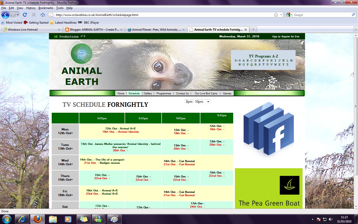
I really like the layout of this shedule page for the discovery channel. I can fit this on my page and it is not too complex to input into a page. I will probably use this as a template to make mine. I do not like the lack of colour in this but I really like the confined schedule box which fits nicely onto the page.

This is also a good example of a schedule page from the bbc3 website. I will use this to help me as well. I like the small confined space that the schedule is in. and the amount of colour used in it.
Sunday 11 October 2009
Choice of fonts
After fiddling around with all different size fonts and styles, I decided that microsoft sans serif is the one that looks most professional. Before this I experiemented with comic sans, times new roman, tahoma, ariel,
All the fonts I tried to display in my links bar didn't look right, it looked like an unexperienced student had chosen a pretty looking font.
Below are displayed the word 'Schedule' a few times in the different fonts I used with the one i chose at the very top.
All the fonts I tried to display in my links bar didn't look right, it looked like an unexperienced student had chosen a pretty looking font.
Below are displayed the word 'Schedule' a few times in the different fonts I used with the one i chose at the very top.
Schedule – Microsoft sans serif
Schedule – Arial
Schedule – Times new roman
Schedule – Comic sans
Schedule – Tahoma
Saturday 10 October 2009
images I have created on fireworks to improve the graphics of my website
There is a grey outline on all of the images I have created because black seemed too bold.

This is the table of links to other websites which are connected with Animal Earth. This is a picture that I have created in Fireworks. When I placed it into Dreamwever, I created hotspots on the real websites to link them to their addresses.
A hot spot is a shape you can drag onto an image in Dreamweaver which is invisible when viewed on any browser. You can then right click on these shapes and make a hyperlink which links a section of the image to a different website. This is a better solution to making a table because tables are hard to make look good.

This image was created by accident. I found an old picture of my cat's eye and a clipart image of some bubbles. I merged them together in Fireworks and came up with this. I decided it would be an effective picture to advertise a scientific program.

This image was created by accident. I found an old picture of my cat's eye and a clipart image of some bubbles. I merged them together in Fireworks and came up with this. I decided it would be an effective picture to advertise a scientific program.

This is the image I am going to use to advertise a tv program beneath the video sequence. I have used the image I created by accident because it was a good choice for the name of program I picked.

This small schedule box advertises the brief schedule for the day. I again created this in fireworks. I got the idea of this from the discovery channel website.
Friday 9 October 2009
Development for the homepage


After making the top of the page of the tv channel website perfect, I started working on the bottom. I found adverts to place there and created the bottom bar with the words "Channel 27 on Sky and Virgin Media, channel 198 on Freeview."

Within a day of editing what I had created previously and a lot of referring to my research, I decided that the website should be square so it would fit any shape computer monitor/screen. I made it square and fitted all of the pictures and ideas in the space so everything fitted perfectly like a jigsaw puzzle; meaning there was no black white spaces. Moreover when referring back to my research, I found that most of the websites where aligned to the middle of the screen. I did this by selecting the option at the bottom which says 'align page centre.'
When I had sorted out the issue of sizing and placing, I found that the navigation bar did not look professional enough to be for a real tv channel website. I played around with techniques and effects and still could not find what looked could improve it. I then went into Fireworks and created a rectangle; filling it in with an emarald setting which I modified from a custom Fireworks preset. I put a rectangle in each end of the navigation bar to neat it up.


When I first began to put my idea together using the pictures I made; posted in the next post, I came up with this. This homepage design in this stage is very weak but the ideas are beginning to shape.
For the navigation bar, I have inputted two extra rows; one below and one above. In Fireworks, I then drew a thick black line which is long enough to fit into the navigation bar. I inserted it into Dreamweaver and placed it into the top row and copied and pasted it into the bottom row. When all the images were in, I resized the rows so it looked like the black lines were the outline of the navigation bar; increasing professionality.
Tuesday 6 October 2009
Starting the website
I have started to create my website using the colour scheme of green to help me to get a decent structure.

This is a print screen of the website so far after I have deleted the 1st logo and inserted the 2nd logo. I think that this looks much better and the quality level has increased.
Looking at all the features of websites, I found that they all included search boxes and an a-z of tv programmes so I included that on my website which looks quite effective and it starting to form the boundaries to look professional.
This is the previous printscreen before I improved my site.

Monday 5 October 2009
Logos for website

These are 2 logos i created for my website, I tried using the 1st one to begin with but after I realised it didn't look quite right so i am now going to try using the other logo. The 1st logo didn't look right with the monkey background in the header because the 2 ideas do not relate in colour and shapes. The shape of this is too square and bold meaning it does not blend in with the header and looks strange.
I have chosen the 2nd logo because it has brighter colours like the monkey and doesn't have a definate shape. Futhermore it still has the same attributes as the 1st logo, but it is just neater.
Sunday 4 October 2009
Pictures I have taken for my website

Ignore the date of which this picture was taken as the date was not set. This is a picture I took of the trees in Danson park which I have used as the background of my website.

This picture has been resized to fit in the news part of the website. This was taken by me at London Zoo.
Saturday 3 October 2009
Names for wildlife/animal channel
I have thought of some names for my tv channel
creature kingdom
channelearth
wildlife uk
cat community
animal earth
animal sector
After looking at these carefull, I am going to use the name 'animal earth' as it has not been used commercially before.
creature kingdom
channelearth
wildlife uk
cat community
animal earth
animal sector
After looking at these carefull, I am going to use the name 'animal earth' as it has not been used commercially before.
Thursday 10 September 2009
Final initial ideas on TV channel website homepage
I am going to produce a wildlife/animal Tv channel website. It is going to have a strong theme of water and long plants. My colour scheme is going to be mainly green although there will be some blue in there and brown.
Next I am going to list my ideas of names for my wildlife channel.
Next I am going to list my ideas of names for my wildlife channel.
What I'm going to take away and use to help me in my website
I am going to take away for my homepage
- The main video being right in the middle of the page or set slightly to the right (disney)
- A simple theme (uncluttered homepage) which looks effective. (food channel)
- The logo on the top left hand corner. (all tv channels that I have looked at)
- The box at the bottom for links and networked pages.
- TV lineup
- The use of adverts at the sides and bottom of the homepage.
Research on TV channel websites
Animal Planet


- The first thing you see about this website is the "its not all about wales". It captures your attention so you then look at the other features on the website. This is a slow slide show showing the audience what this channel has in store. This takes up the whole of the tiop half of the page.
- This design is a lot like the discovery channel as it is by the same people.
- The header includes the logo, a search bar and a slogan as the most prominent features you tend to notice in that particular place.
- There is a large advertisement banner at the top of the page which I cut off in the printscreen however I don't think this is necessary.
- The links for other discovery sites are repeated at the bottom of the page but with logos.
- In the middle there is a box of a big variety TV shows.

- This website is set out a lot like the bbc website.
- There is a big space at the top of website for logo/header.
The content of the site is listed across the top of the page, built into the header. The channel number for sky, virgin media and top-up TV are integrated into it too. - The theme of the page makes a strong background the the theme is carried on throughout the site.
- The login/reigster part is located underneath the header rather than in it and has a site search under that too but more graphical.

- In the centre of the page is a slide show of highlights of the week, upcoming exciting programs that the channel wants you to watch.
- To the left of the sideshow is a link to clips on the site, but no actual videos.
- Below the slideshow and still really in the middle of the page are advertisements of facebook, people wanted for presspacks and competitions.
- There is also trivia, a couple of advertisements at the bottom that you can't see when you 1st navigate to the page and a list of gold stars who are loved by the gold viewers. This is displayed using pictures and when you hover you mouse over it, an arrow points at it and reveaols information about the actor/star.
- At the very bottom of the page is a small space for quick links to other sites. This is just done in plain writing because it is no very important.
Food Channel
- In the header, the logo is set in white on its own. Underneath but still built into the header is the list of content on the site. The strip for this is in a different colour to the header. Also in this green stip is a site search bar.
- There is a place to sign into the site to get more specialist info on food.
- When you 1st navigate onto the page, you see a slide show of pictures of food advertsising dishes and opportunities.
- Below the slide show is a 'featured video'.
- To the left of the featured video is the 'recipe of the day'
- All of the parts of the site that the Tv channel wants you to spot 1st, are there right staring at the audiences eye.
- To the very right there are advertisements are twitter pages and surveys which obviously earn the channel and twitter, money. These adverts go right down to the bottom of the page.
- After that is a long list of the resturant/food related news which is laid out quite a lot like the bbc websites.
- There is no theme for this page, its just plain. The only theme I see is the green strip across the top of the page which shows life and health.
Disney Channel
- As soon as you open up the page, a video in the middle automatically starts playing to get your attention, however some audiences may find this annoying if that starts everytime they refresh or go back to the page.
- In the header of the page, there is a big space for an ad. The list of content of the site are listed along the top but below the ad. The disney logo is integrated into the side of it.
- Below the content of the page, there are 9 picture of disney shows that get bigger when you move your mouse over them. These are links to the pages on the shows. Furthermore there is a link to the side of this saying to click there to view the rest.
- Located in the centre of the page, including left and right are the 'what's hot' and 'what's on TV' etc. This makes it easier to find.
- Underneath the middle section is a box with games advertised in big bright colours. This site is obviously to amuse kids.
- At the very bottom of the page is graphical links for arts and craft printouts and e-cards. This is just a bit of fun.
- There is only really one paying advertiser on the page which isn't clearly seen when you 1st navigate onto the page.
- The whole site is themed with a deep blue and a pattern in the background which looks like the whole site is placed into a crystal ball, relating to disney films such as cinderella.
Discovery Channel
- Advertisement banner across the top of the page.
- Header includes logo, a site search bar, links to other discovery sites without the logos, links of the discovery shop, a discovery travel site and the list of website content across the page attached to the head but underneath the bulk of it.
- The top video of the week is located on the right hand sites and has a list of 4 more top videos to watch.
- On the left hand side of the page, there is an advertisement for the most devastating/exciting news. The discovery channel clearly wants to try and explore the causes and fascination of such events which will draw in an audience.
- Below the devastating news, is a column for recent discovery news, features and a list of games.
- In the bottom right hand corner is the listings for today and a link to the rest of the listings for the next upcoming week.
- The links for other discovery sites are repeated at the bottom of the page but with logos.
- In the middle there is a box of a big variety TV shows.
bbc 3
- Big space at the top of website for logo/header.
- The content of the site is listed across the top of the page, built into the header.
- All of the video links and highlights of the week is set in the middle in a big square to look like a big TV.
- Listings along the side of the page to show the days of the week rather than the highlights but take up much less space.
- There's a Tv programmes a-z section on the top right hand corner which is clickable and links to the programs in chronological and alphabetical order to show what is on TV or what has already been on.
- Above the big square of showings there is an advertisement for programs to boost ratings which changes every now and again.
- On the right hand side of the page there is a news bulletin that states the most recent news. For example today, (16/9/09) it says: Dirty Dancing film star Patrick Swayze dies aged 57 after a long battle with pancreatic cancer, his publicist says.
- BBC header is at the very top to show that it hosts the bbc3 site.
- At the bottom is all links to other bbc hosted sites, for example, bbc radio, cbbc, bbc1 and bbc hd.
- Under the big square, an advertisment of i player has been made and links of yet 3 more links to well reccomended programs. This makes the page easier to navigate.
- The theme of the page makes a strong background the the theme is carried on throughout the site.
Subscribe to:
Posts (Atom)